Sweaty Monkey Hands and Robber Barons, or, Understanding Brand Personality

Are you quiet or outgoing? Playful or serious? Friendly or standoffish? Now what about your startup? What words do you and, more importantly, your customers, use to describe your startup’s personality?
As it turns out, the best way to describe your brand personality is with these kinds of human terms. Brand personality is one of the most visible elements of the Brand Strategy Canvas. And because it’s described in such accessible terms, it’s also one of the most fun to discuss.
When you think about which companies have a strong personality, lots of great examples come to mind. Dollar Shave Club and Old Spice inevitably come up, and for good reason. They’re entertaining and memorable, and seem to resonate with the target audience.
But does personality always have to be funny or entertaining? Is it possible to have a brand personality that’s more serious and reserved, while also being strong and effective? What type of personality makes the most sense for your startup based on your values and your positioning statement?
Strong personalities aren’t so much about being funny or serious or what have you. Rather, strong brand personalities are ones that:
- are true to the values of the company
- resonate with the target audience, and
- take advantage of an opportunity created by an opening in the competitive set
So let’s look at two very different examples of brand personalities. One’s funny, ones’ serious, but both authentically communicate their brand in a way that makes sense for their target audience.
Mailchimp
Okay, so everyone loves Mailchimp (mail-khimp?). And for good reason. For most users, the product is exactly what they need. I use it for several side projects, and recommend it regularly.
The MailChimp personality comes through in lots of ways. The name is a big one, as is the mascot: a cartoon chimp. The color palette could be described as friendly and contemporary, as opposed to the more traditional navy blues and grays.
For me, the MailChimp personality really shines in moments of high user stress. If you’ve ever deployed an email campaign, you understand the stress that accompanies pushing the SEND button. Whether there are a million recipients or just a dozen, you don’t want to send out typos or broken links.
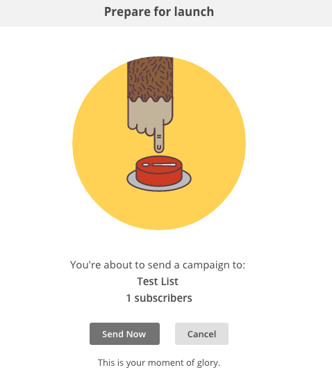
Right when you’re about to press Send, this box appears:

Yep, a big sweaty monkey hand hovers over a terrifying red button. In this instance of user anxiety, MailChimp introduces a bit of humor to lighten things up. And notice the copy below: “this is your moment of glory.” Okay, says the sender, I can do this.
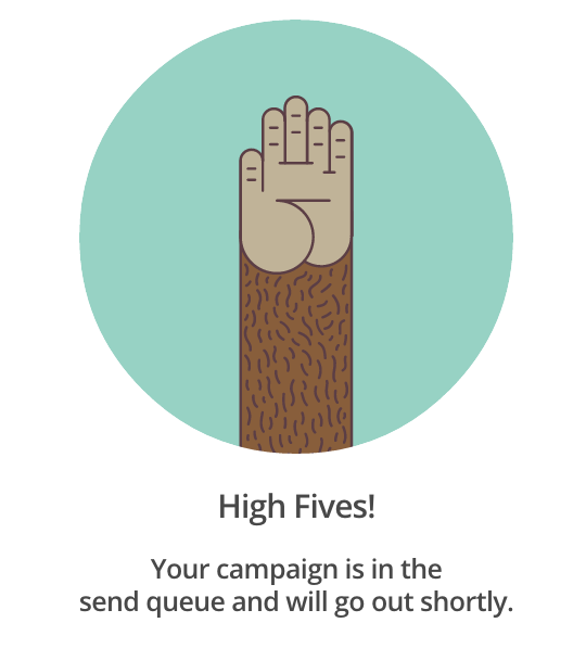
And when you do, you get this:

An animated monkey-hand gives an awesome congratulatory high five. And not just a high five, but “High Fives!” Notice the colloquial usage and the intentional inclusion of the exclamation point. I hate exclamation points in copy, mainly because they don’t typically serve a purpose and rarely fit the brand. But in this case, it works! MailChimp genuinely is excited for you.
You can see how these interface and copy choices flesh-out those traits. It’s a great example of the execution—UI, design, copy—reinforcing the strategy—brand personality.
If MailChimp were to fill-out the Brand Strategy Canvas, this kind of user insight—that the moment of Send causes stress and anxiety—would come through in the very first box. Then, in the positioning statement, it might be included as a pivotal element of the brand strategy. This is a great example of personality aligning with truths about the target audience.
From a competitive perspective, the MailChimp brand stands alone among competitors who have taken a more conservative approach to their brand and messaging. Constant Contact, AWeber, and Vertical Response, for example, have largely built their brands around a traditional, conservative approach to email marketing. And into this milieu, you’ve got the quirky, friendly MailChimp brand.
Okay, we know Mailchimp is a funny and powerful brand overall. In fact, lot’s of startups go the tongue-in-cheek direction. And that’s totally fine as long as it’s true to your actual personality, values, and what you discovered in the positioning statement and Canvas overall.
That said, sometimes exclamation points and jokes don’t make sense. Is it possible to have a strong personality if that’s the case? Absolutely.
Harlan Estate
Take Harlan Estate. A producer of high-end wines in Napa, Harlan Estate has built a brand around exclusivity and quality. Were they to complete the Brand Strategy Canvas, they would likely describe their target audience as discerning, both of wine and of culture. They take pride in exclusive experiences, and have the income to spend on expensive wines (on the secondary markets, Harlan wines have been known to go for $800+ per bottle).
To gain the privilege of buying a single bottle—not even a case—of Harlan Estate wines, potential customers must first add themselves to the mailing list on the website. Eventually, they’ll receive an invitation to purchases their first bottle.

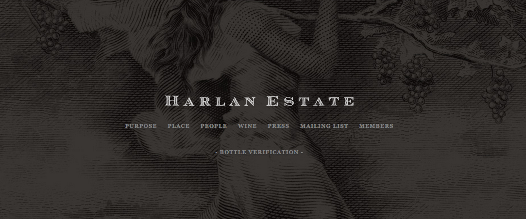
As you’ll notice, their website is sparse, and minimalistic. The type and background on the homepage evokes paper money. There are no animations or transitions. And it relies heavily on rich black and white photography (which happens to look pretty awesome).
There are also some very opinionated pieces of copy as well. They’re not necessarily in headlines, but are largely buried in PDFs, which, I imagine, is another deliberate choice. In his Note from the Proprietor, H. William Harlan (is he named after a 19th century robber baron?) says this:
In the quarter of a century since we found our particular piece of land above Oakville, our knowledge of it has deepened and our understanding of wine’s great traditions have broadened. Yet we have only just begun to understand this land sufficiently to bring it into its current form. And I feel that is as it should be, for fine wines evolve over decades, and winegrowing estates, families, and communities across generations.

This guy has done serious thinking about his craft. And that is fantastic. As a result, this is an example of a brand with an incredibly clear sense of identity. As you might imagine, exclamation points, animations, and mascots would make zero sense in this context.
If you were describing your pal Harlan Estate, you might say he’s serious but has great taste, dedicated to his craft and is unwavering in his commitment to excellence. He’s refined and reserved, authentic and honest.
On the other hand, if you had a friend who wasn’t a fan of Harlan, they might say he’s snobby, a bit condescending, and probably inaccessible. But that’s okay. Because Harlan Estate does what’s true to who it is. There are plenty of people who identify with that, and, as a result, buy their expensive wines.
As you can see, Harlan Estate has a very clear picture of its target audience as well as the market opportunity for super-exclusive wine. Into that context, they’ve asserted their values, which, when executed, express themselves through the design and copy choices made above.
the takeaway
At the intersection of those three key ares of the Brand Strategy Canvas—customer insight, competitive environment, and company values—MailChimp and Harlan Estate have successfully created strong brand personalities that resonate with their audience and leverage an opportunity in the competitive space.
And most importantly, their personalities are authentic. By “authentic,” I mean that the the expression of their personalities is true to their values. The personalities don’t feel manufactured or contrived, because they aren’t. Indeed, they are rooted in truth.
Personality is only one part of a strong brand strategy, but because it’s so visible and experiential, it’s among the most crucial. Of all the elements of brand strategy, personality provides the most tangible connection between your strategic choices and how the world experiences that strategy.
That’s what brand personality is all about: dialing-in to what you believe, and communicating those beliefs in a way that’s true. Your execution, i.e. copy, colors, UI, and design, should always support decisions made in your brand strategy.
In that context, personality can be seen as a helpful bridge between the core of your strategy set forth in your positioning statement, and the more tangible artifacts of your brand.